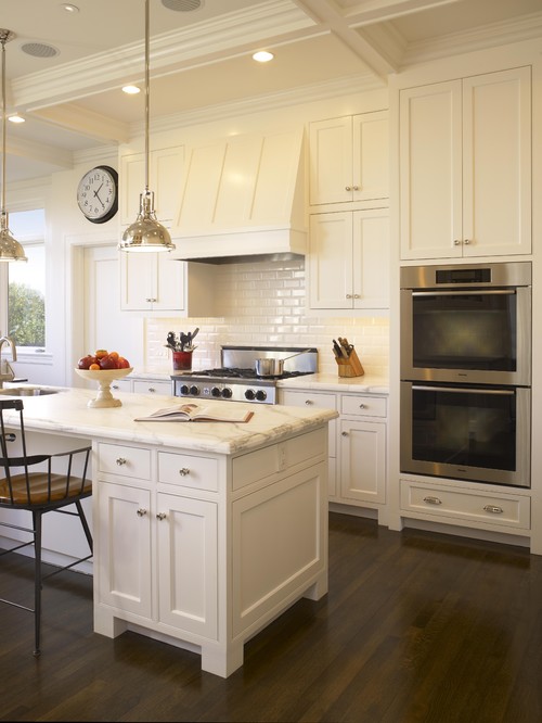
This first kitchen from Houzz has beautiful Calacatta Gold marble countertops.
traditional kitchen design by san francisco general contractor Mueller Nicholls Cabinets and Construction
This next kitchen has Bianco Romano granite countertops. These particular slabs really have the look of marble without the etching! I love the yellow accents in this kitchen as well. It's quite the happy kitchen.
The countertops below are Yorkshire quartz from Cambria. It's more of a creamy color in real life, it's a really beautiful alternative to marble.
A beautifully simple kitchen. I'm not sure what the countertops are, but I'd guess 2 cm Carrara marble. The white subway tile backsplash is the perfect finish on this white kitchen.
Last we have one more Carrara marble kitchen. I personally love all white dishes, I think they look great on this open shelving.
What is Whiteout Wednesday? Read here.
Now, are you ready to catch up?


3 comments:
Whiteout Wednesdays are very, very dangerous for me. Calcutta marble has me absolutely swooning even though I well know that I'm far too messy of a cook/person to have marble.
Have you seen Hanstone's Aspen at all? I think it's relatively new, but I got the impression that it looks somewhat similar to marble. Would love to hear what it looks like in "real life."
Erin-
I have seen the Aspen in real life.
I personally don't like quartz (or any other surface) that is trying to look like stone. So when I first got my samples of it I sort of tossed it aside.
I saw it in a Parade Home and I have to say I liked it a lot more than I thought it would. A friend that was with me thought it was marble!
I haven't done a job out of it yet, but after seeing it installed it would be a quartz I'd recommend.
That's a good report, Steph! I agree with you on not liking things that are meant to look like something else: marble is beautiful, why mess with it, but there are disadvantages, I guess.
Post a Comment